Use the preview and check different screen sizes
On this page
Use Preview to click buttons, fill in forms, and check layouts at desktop, tablet, and phone widths. This guide walks through the main pages, fullscreen preview, and turning what you find into a change request.
Before you start
Open a project with a saved app version and check the version number at the top. If generation is still running, wait for the task to save before trying the result.
This guide uses Client Notes Studio and fictional client records.
Switch to Preview and try the page
- Choose Preview in the canvas toolbar to interact with page buttons and forms.
- Use Select page to open the page you need.
- Try its main actions, such as searching, filtering, opening a record, and opening a new-client form.
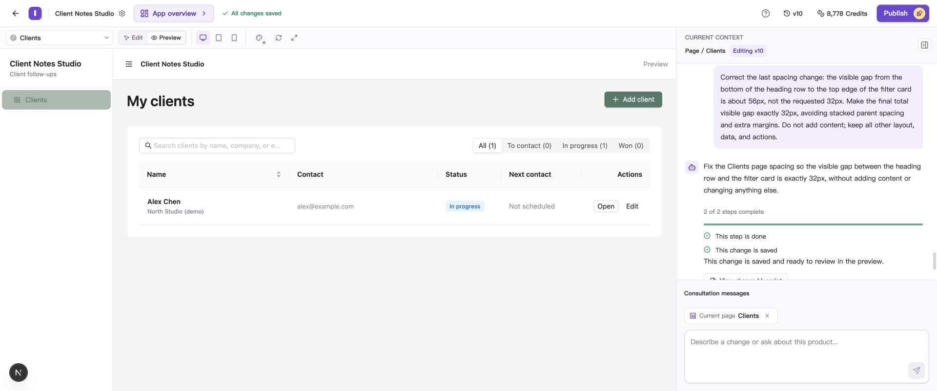
Try search, filters, and the new-client action in Preview.
A details page often needs an actual record. Opening it directly from the selector can show “Record does not exist.” Return to the list and open an existing client using the app’s own controls.
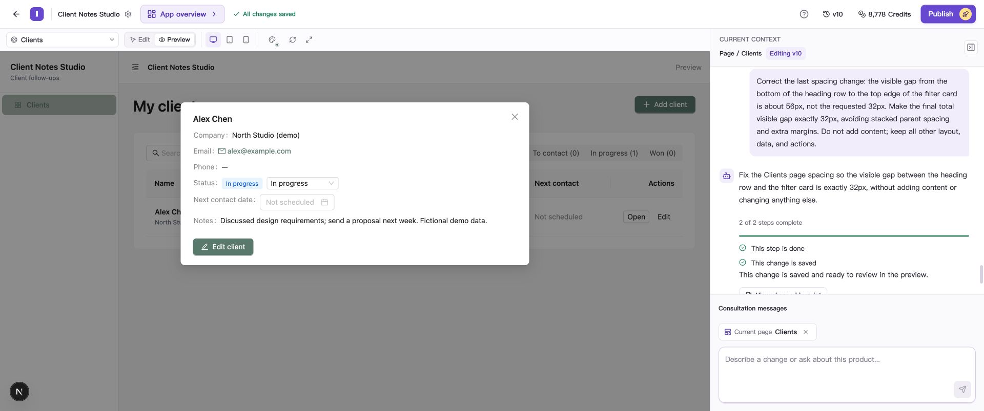
Open a client from the list to inspect its fields and actions. This example uses a details panel; your app may use a separate page.
Check Desktop, Tablet, and Mobile
- Choose Desktop and check navigation, lists, and forms.
- Choose Tablet and observe navigation collapse, wrapping, and button placement.
- Choose Mobile and try the same actions, checking readability and ease of use at phone width.
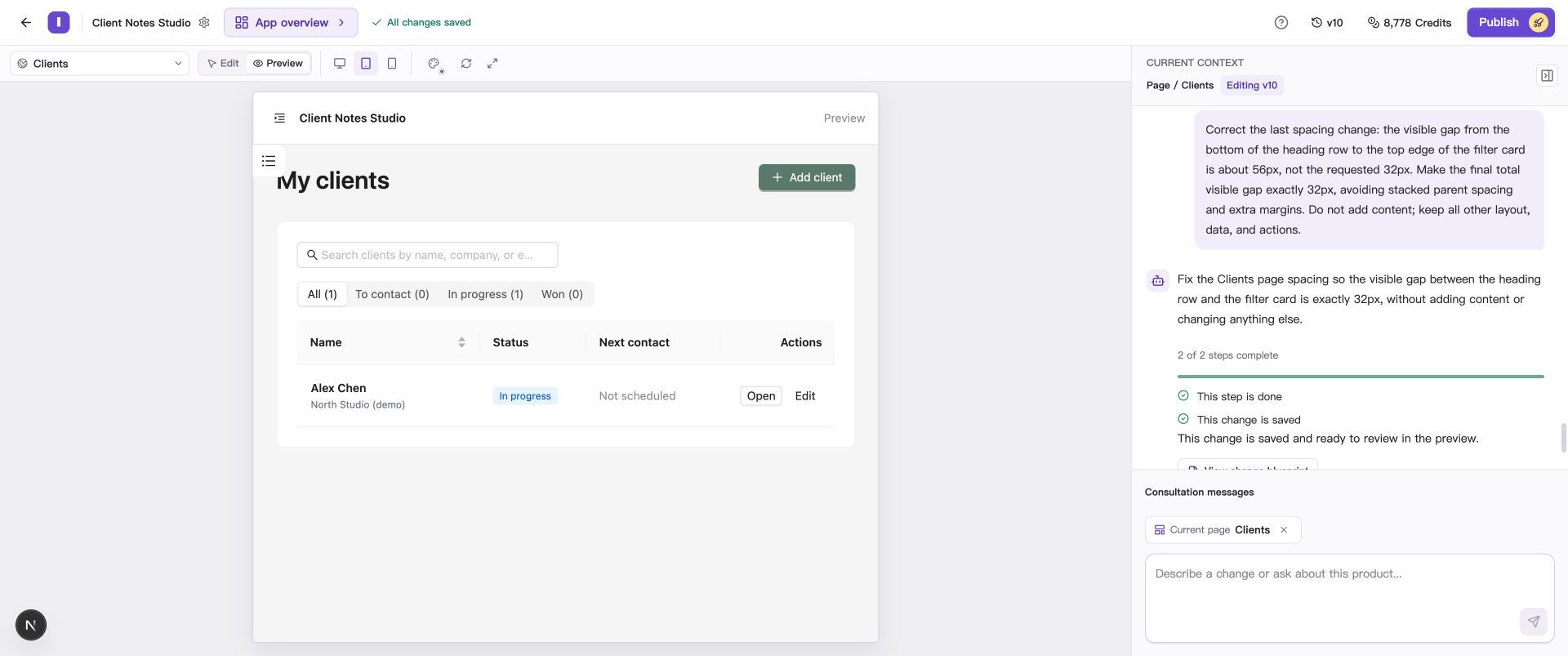
The tablet canvas shows the same version in a narrower space.
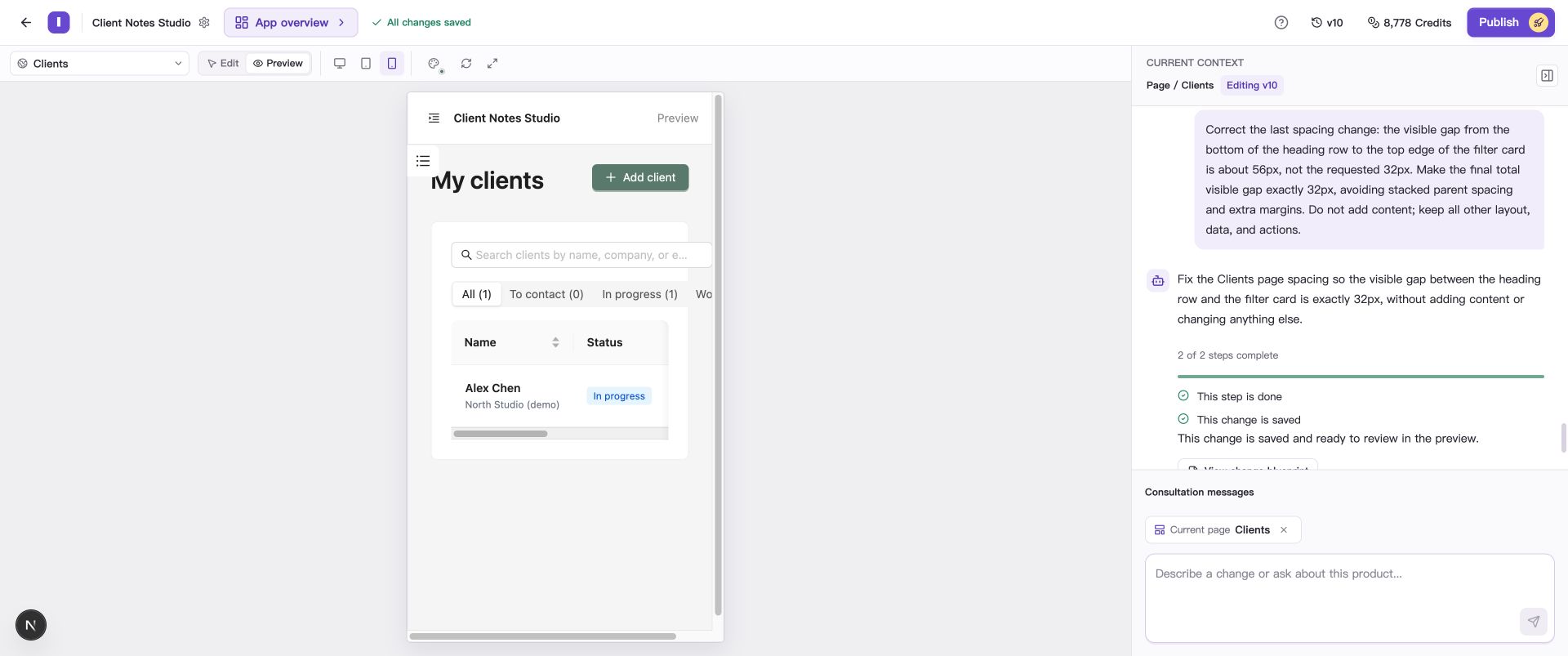
The phone canvas clips some filter labels in this example. A follow-up request can adjust how the choices wrap.
Check that text is readable in full, buttons work, dialogs close, table fields are accessible, and filter choices fit. For a save workflow, enter a fictional record, save it, and reopen it to compare the stored values with your input.
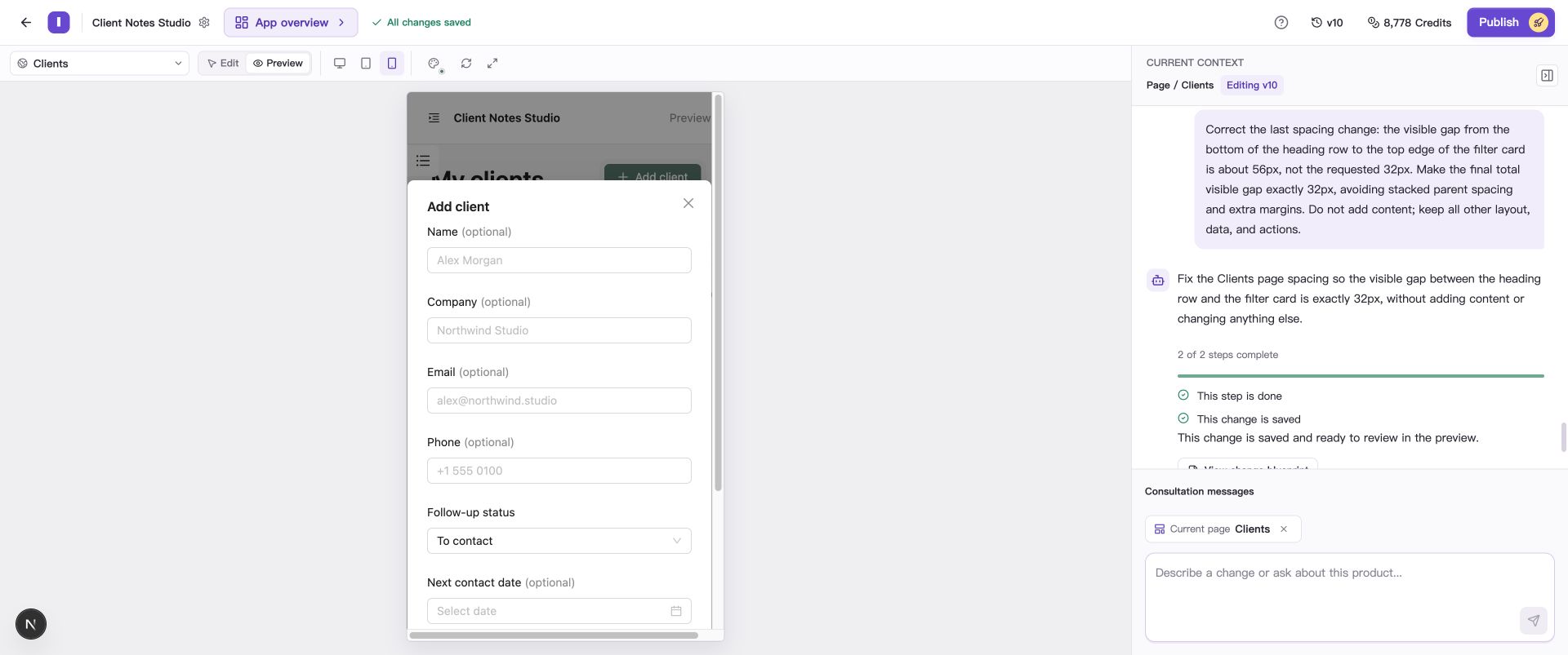
After opening the new-client form, check input, validation messages, and the saved record.
Use fullscreen preview
Choose Open fullscreen preview in the toolbar to inspect a larger canvas. Device sizes and Edit/Preview modes remain available. Choose Close fullscreen preview to return to Builder.
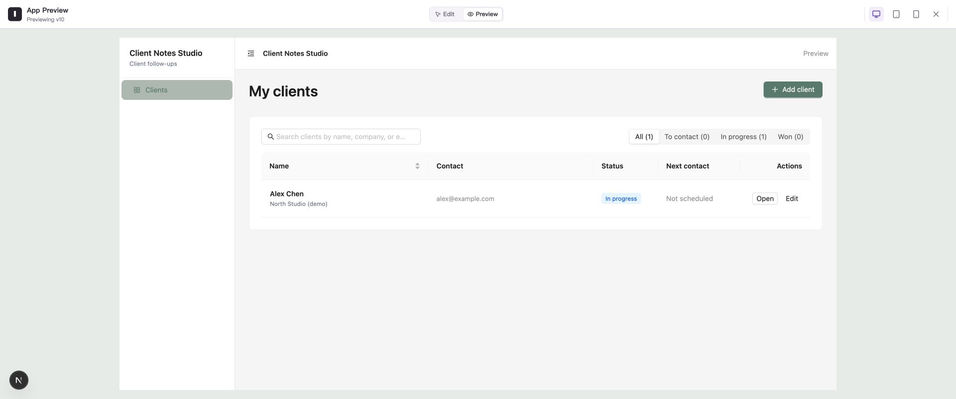
Fullscreen gives you more preview space to inspect layouts and interactions.
Describe a problem precisely
State the page, size, action, actual result, and expected result. For example:
At phone width, client status labels are cut off. Make the filter choices wrap when space is limited, keeping every label visible and preserving search and filtering.
Follow Request changes to your app, then check the same scenario after a new version is saved. If the preview does not show the latest result, use Refresh in the canvas toolbar. See Resolve preview loading problems and page errors for further troubleshooting.
Common questions
What should I check on a real phone?
Try touch controls, the layout with the keyboard open, text input, and permission prompts in the browsers your users use. The canvas helps you check widths first; a real device adds the everyday usage experience.
Why does clicking a button only highlight a component?
The canvas may be in Edit mode. Switch to Preview and try again.
How do I make preview changes available to live users?
After checking the result, publish the current editing version. Follow Restore versions and publish your app for the steps.